Alex Cooke
Research
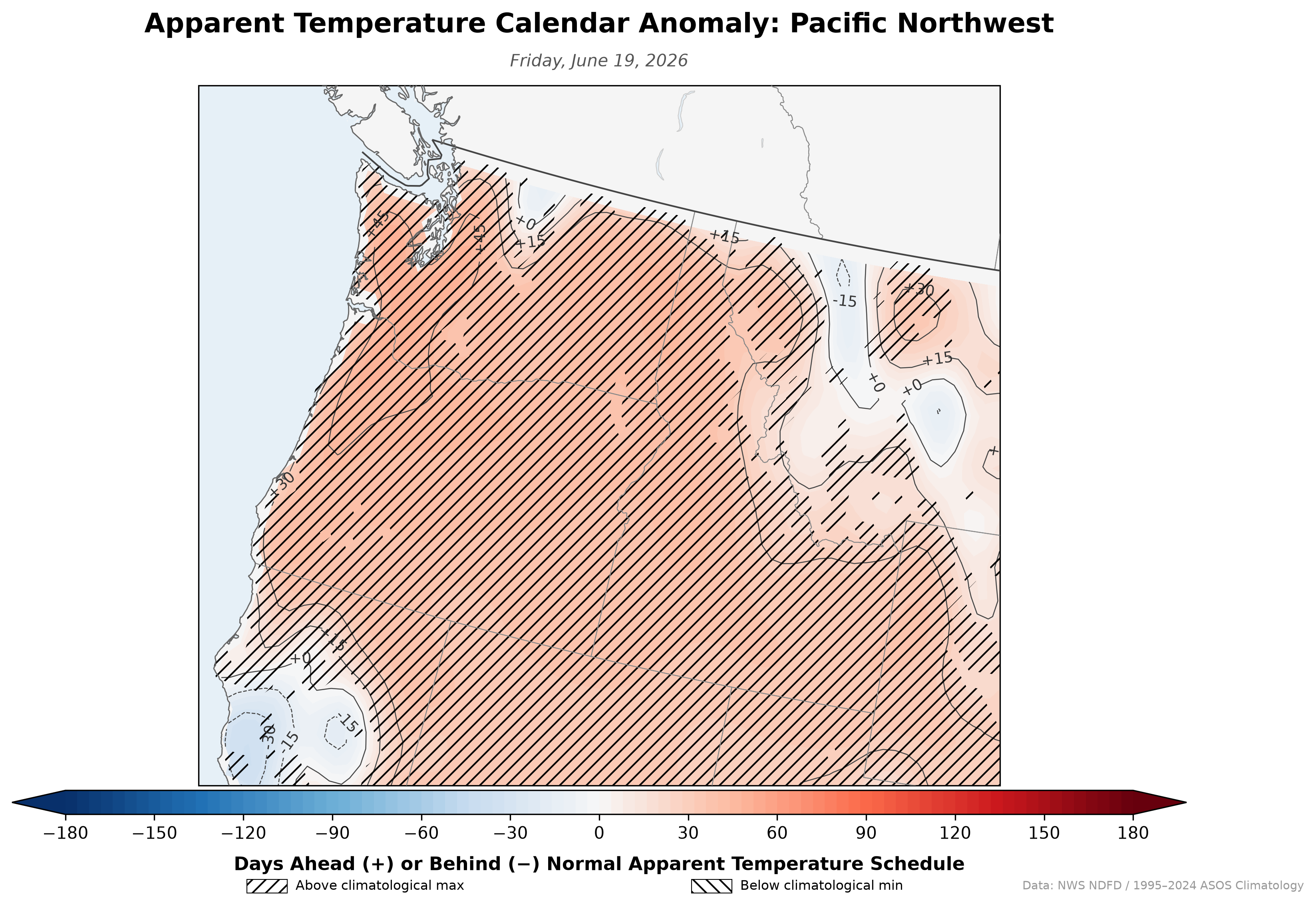
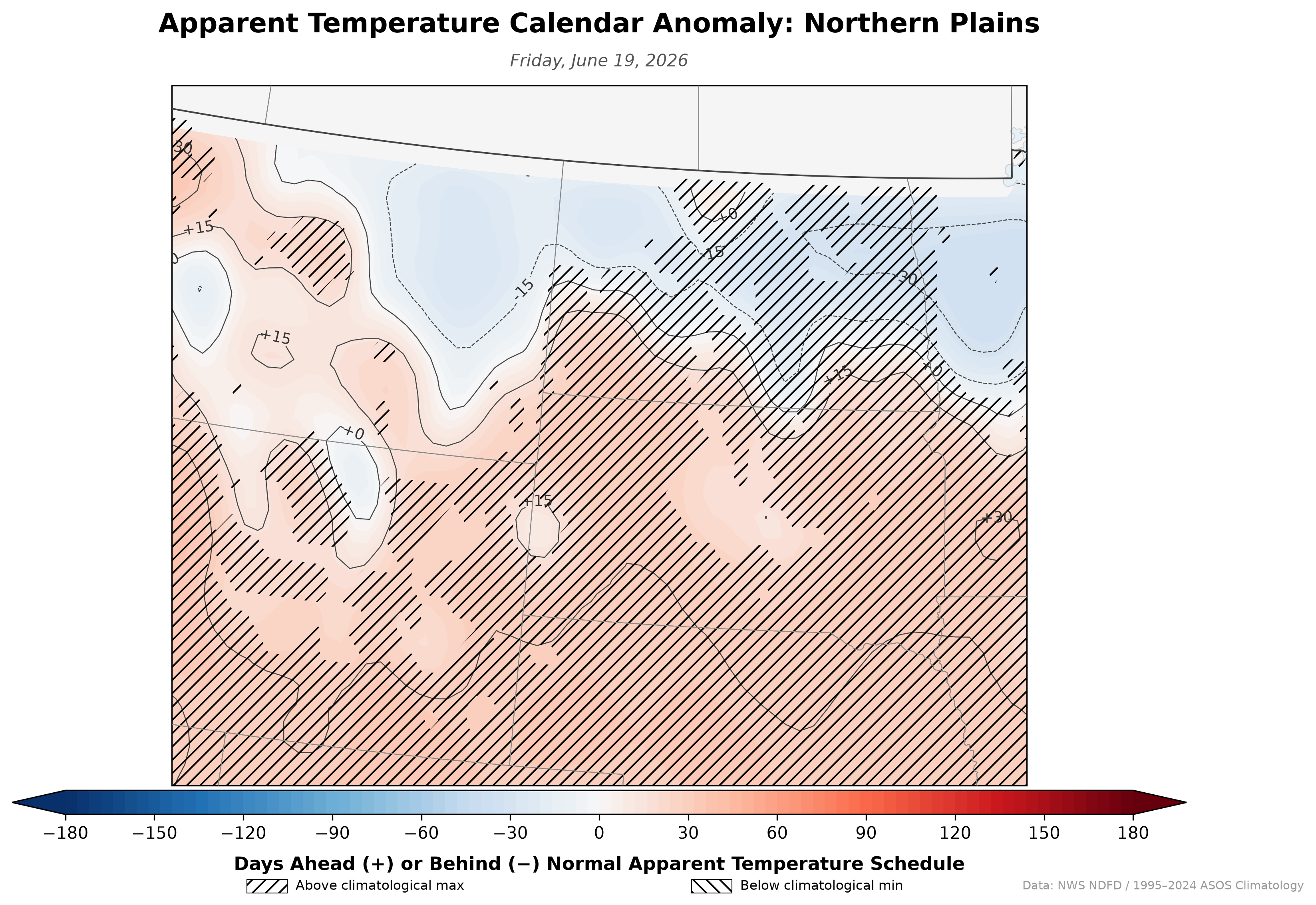
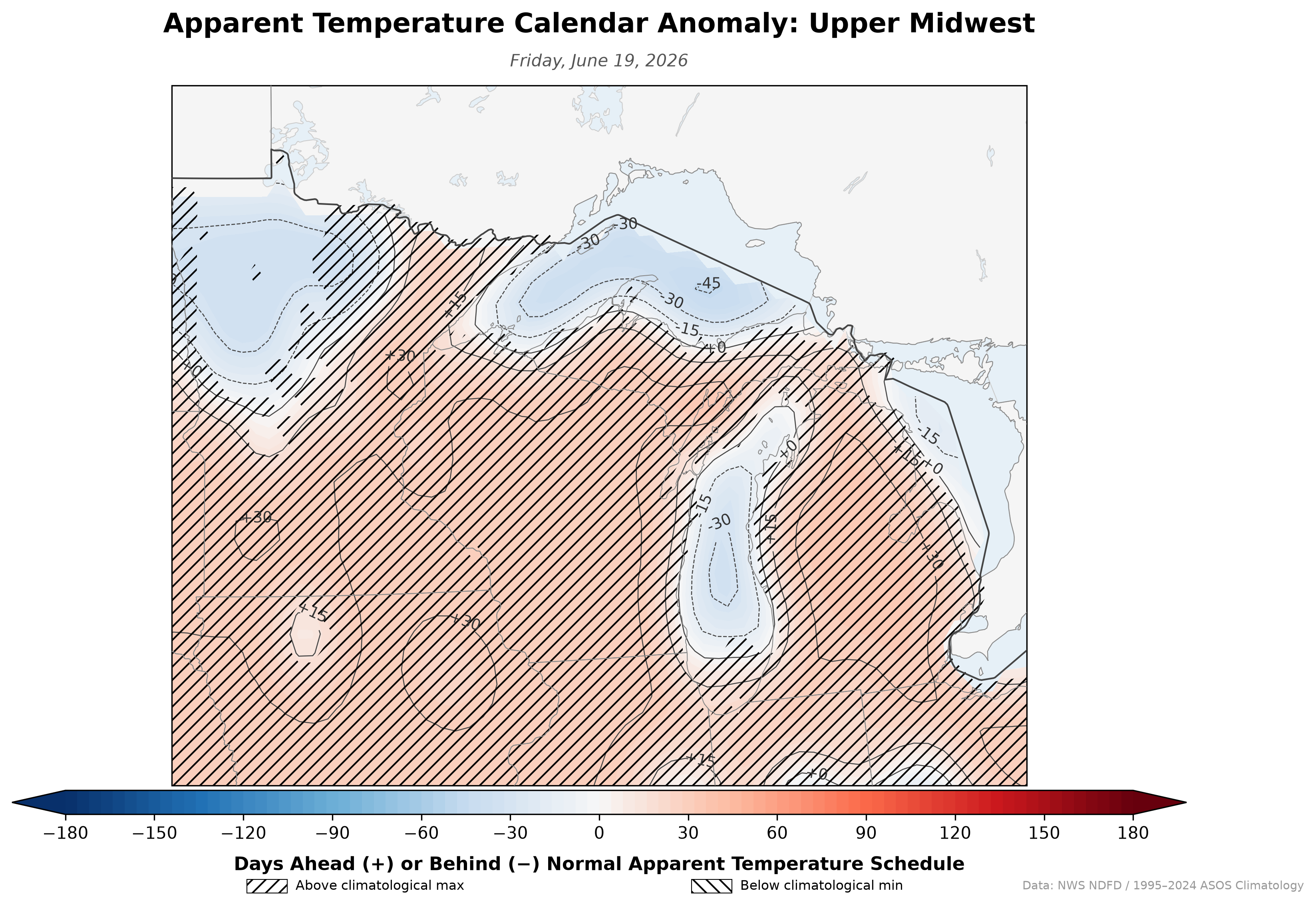
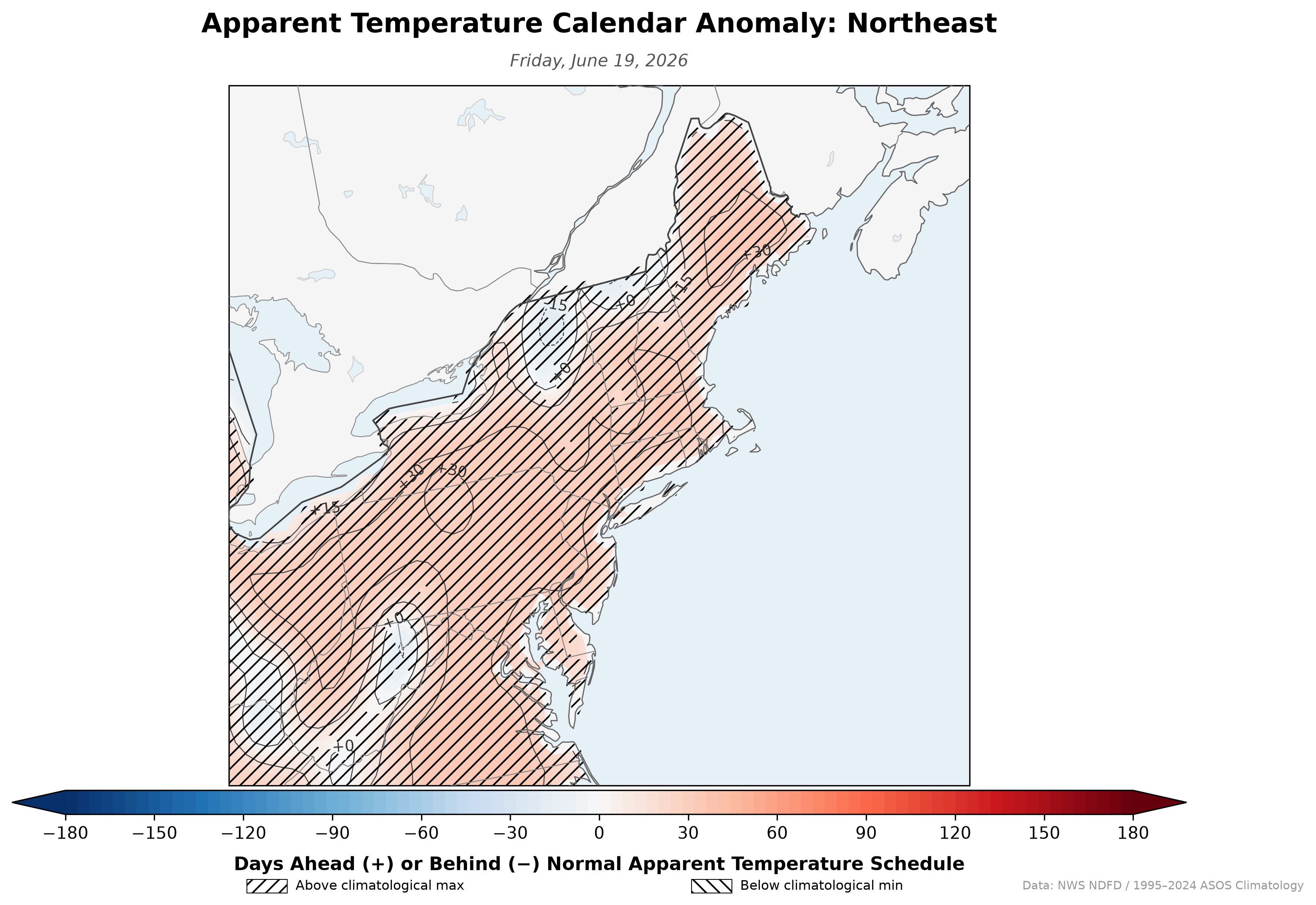
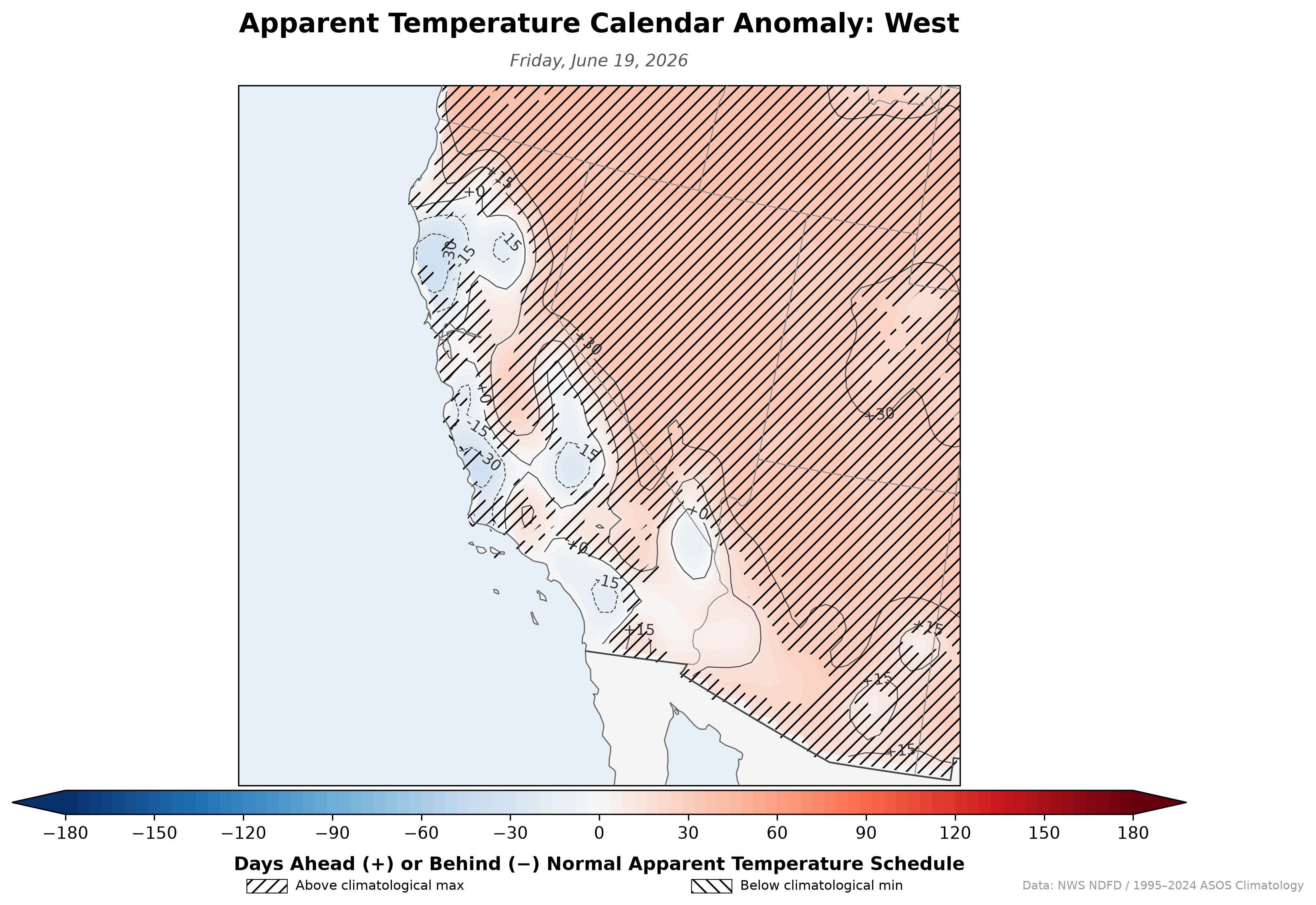
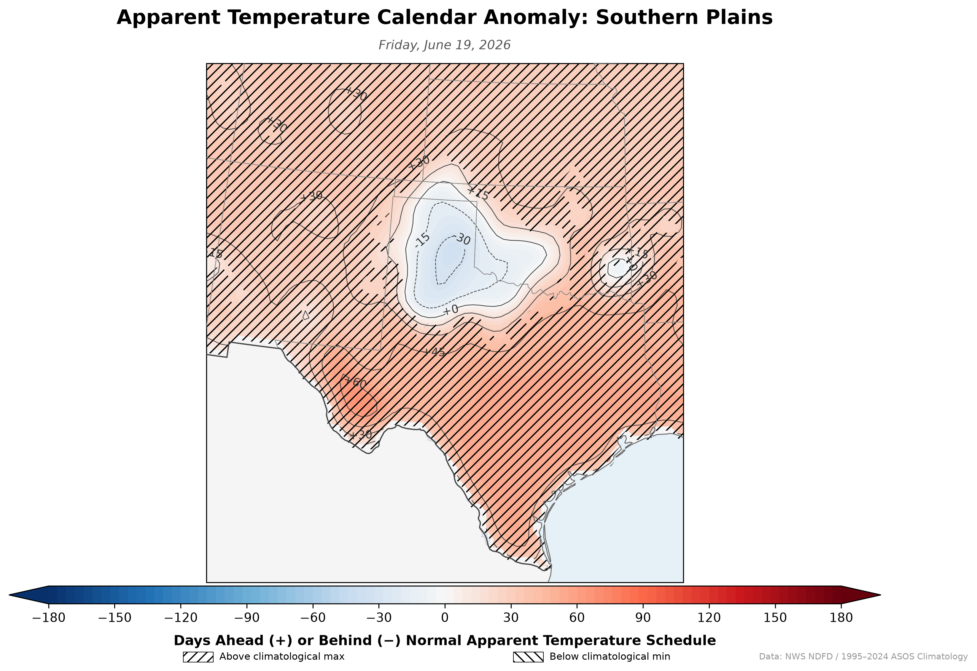
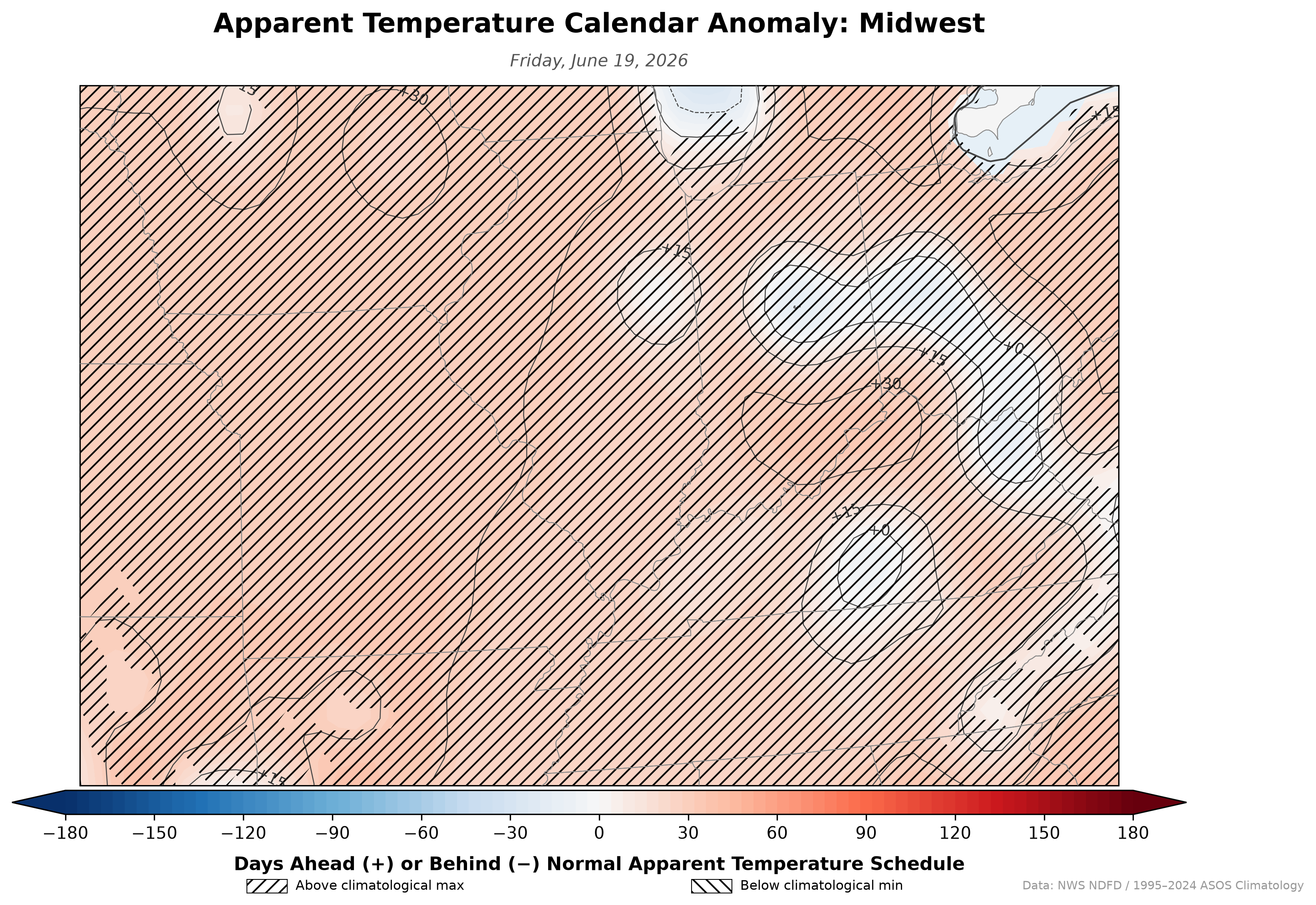
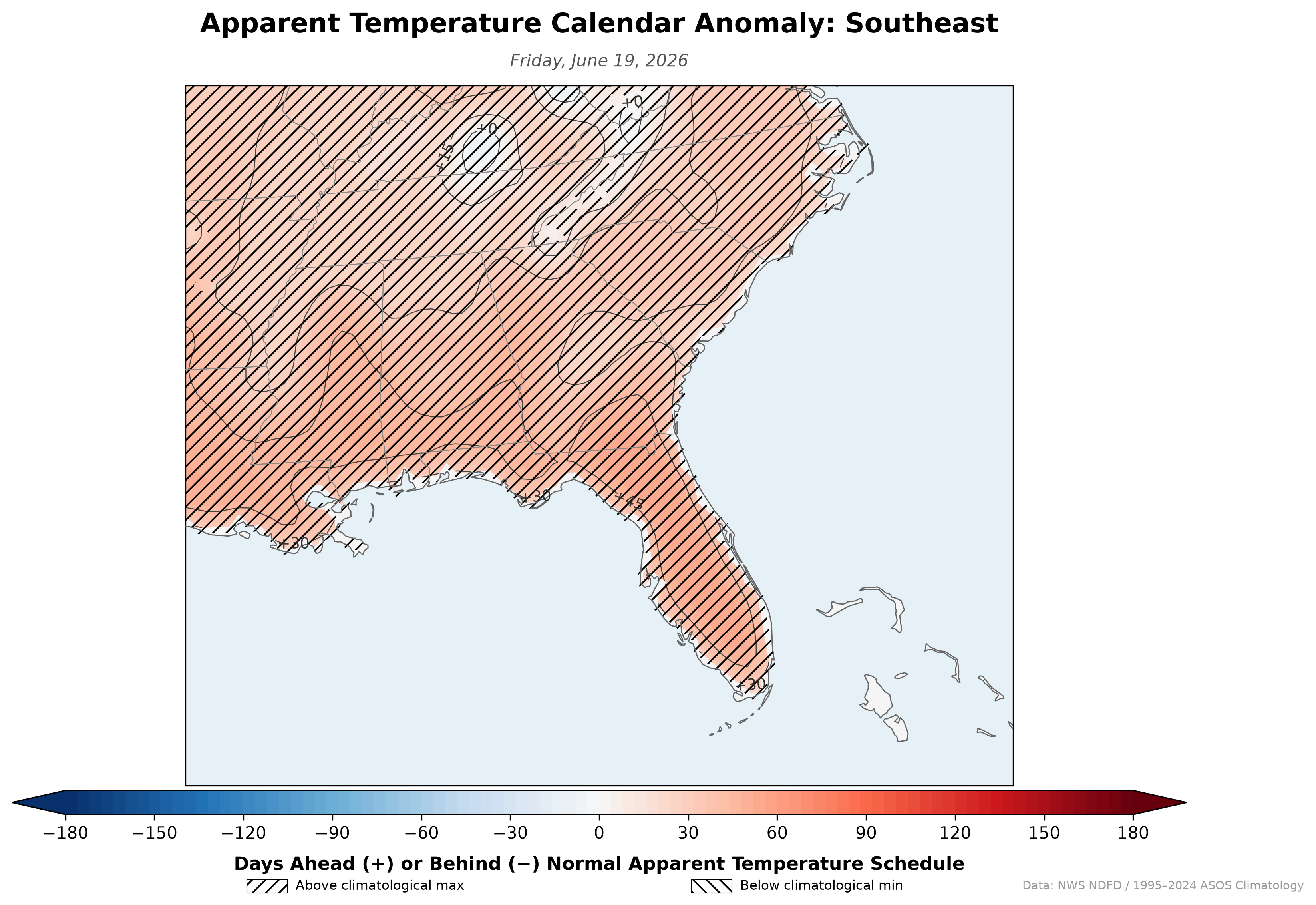
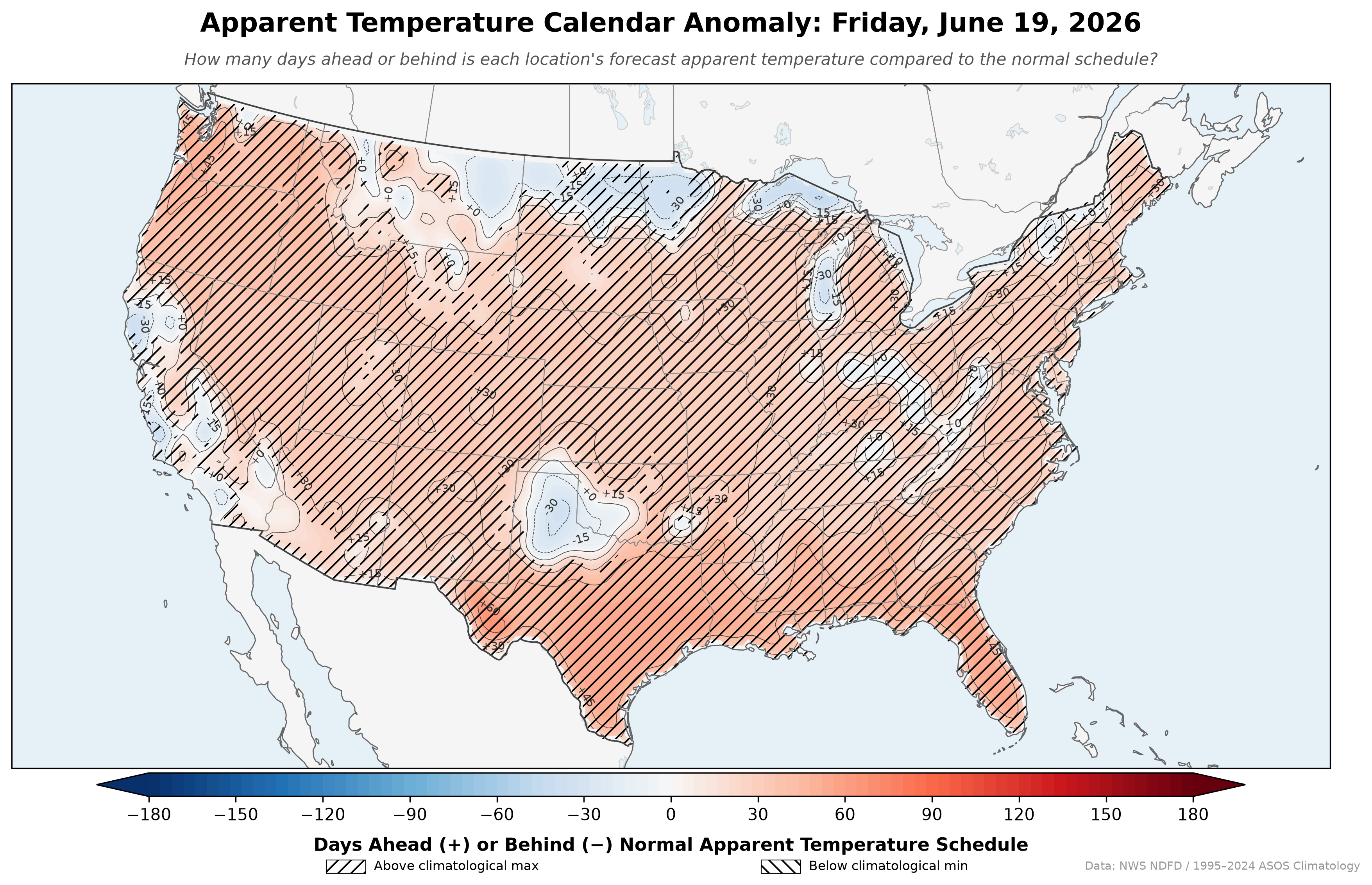
Apparent Temperature Calendar Anomaly
A daily-updating map that reframes apparent temperature anomalies as time rather than degrees. Instead of showing "5°F above normal," it shows how many days ahead or behind the normal apparent temperature schedule each location is. If the forecast feels-like high for July 1 matches the climatological normal for July 15, that spot shows +14 days — two weeks ahead of schedule. Apparent temperature uses heat index when it's hot and humid, wind chill when it's cold and windy, and air temperature otherwise, so the anomaly captures how the air feels rather than just the thermometer reading.
Click the map for full resolution.
This is an independent project and is not an official product of the National Weather Service or NOAA. Data: NWS NDFD apparent temperature forecast / 1995–2024 ASOS-derived climatology.
Browse ArchiveRegional Views
Click any region for a full-resolution crop.